
PANTONE COLOR OF THE YEAR 2021

PANTONE COLOR OF THE YEAR 2021
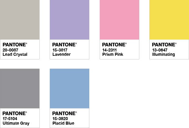
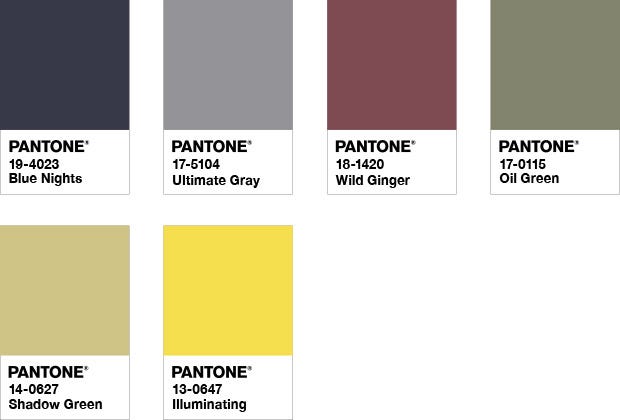
PANTONE 17-5104 Ultimate Gray + PANTONE 13-0647 Illuminating
ANNOUNCING THE PANTONE COLOR OF THE YEAR 2021
PANTONE 17-5104 ULTIMATE GRAY + PANTONE 13-0647 ILLUMINATING
A MARRIAGE OF COLOR CONVEYING A MESSAGE OF STRENGTH AND HOPEFULNESS THAT IS BOTH ENDURING AND UPLIFTING.
PANTONE 17-5104 Ultimate Gray + PANTONE 13-0647 Illuminating, two independent colours that highlight how different elements come together to support one another, best express the mood for Pantone Color of the Year 2021. Practical and rock solid but at the same time warming and optimistic, the union of PANTONE 17-5104 Ultimate Gray + PANTONE 13-0647 Illuminating is one of strength and positivity. It is a story of colour that encapsulates deeper feelings of thoughtfulness with the promise of something sunny and friendly.
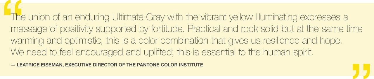
A message of happiness supported by fortitude, the combination of PANTONE 17-5104 Ultimate Gray + PANTONE 13-0647 Illuminating is aspirational and gives us hope. We need to feel that everything is going to get brighter – this is essential to the human spirit.
As people look for ways to fortify themselves with energy, clarity, and hope to overcome the continuing uncertainty, spirited and emboldening shades satisfy our quest for vitality. PANTONE 13-0647 Illuminating is a bright and cheerful yellow sparkling with vivacity, a warming yellow shade imbued with solar power. PANTONE 17-5104 Ultimate Gray is emblematic of solid and dependable elements which are everlasting and provide a firm foundation. The colors of pebbles on the beach and natural elements whose weathered appearance highlights an ability to stand the test of time, Ultimate Gray quietly assures, encouraging feelings of composure, steadiness and resilience.
Emboldening the spirit, the pairing of PANTONE 17-5104 Ultimate Gray + PANTONE 13-0647 highlights our innate need to be seen, to be visible, to be recognised, to have our voices heard. A combination of colour whose ties to insight, innovation and intuition, and respect for wisdom, experience, and intelligence inspires regeneration, pressing us forward toward new ways of thinking and concepts.
ABOUT PANTONE COLOR OF THE YEAR
For over 20 years, Pantone’s Color of the Year has influenced product development and purchasing decisions in multiple industries, including fashion, home furnishings, and industrial design, as well as product packaging and graphic design.
The Pantone Color of the Year selection process requires thoughtful consideration and trend analysis. To arrive at the selection each year, Pantone’s colour experts at Pantone Color Institute comb the world looking for new colour influences. This can include the entertainment industry and films in production, traveling art collections and new artists, fashion, all areas of design, popular travel destinations, as well as new lifestyles, playstyles, and socio-economic conditions. Influences may also stem from new technologies, materials, textures, and effects that impact color, relevant social media platforms and even upcoming sporting events that capture worldwide attention.
ABOUT PANTONE COLOR INSTITUTE™
Pantone Color Institute is the business unit within Pantone that highlights the top seasonal runway colors, selects the Pantone Color of the Year, forecasts global color trends, and advises companies on color for product and brand visual identity. Through seasonal trend forecasts, color psychology, and color consulting, Pantone Color Institute partners with global brands to effectively leverage the power, psychology, and emotion of color in their design strategy.
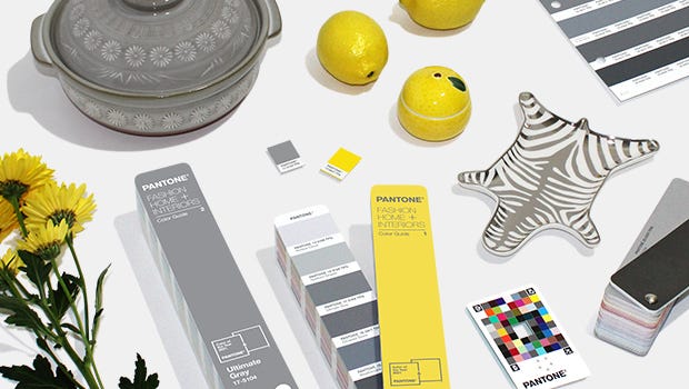
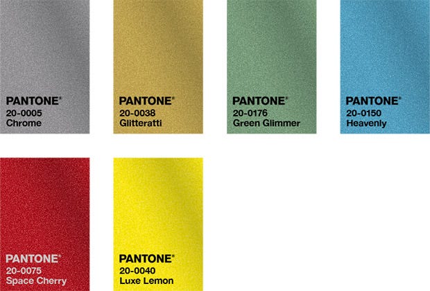
Color Formula & Guides
The Pantone Color of the Year 2021 can be found in the following color systems:

COLOR VALUES
Visit Pantone Connect to get color values for Pantone 13-0647 Illuminating, Pantone 17-5104 Ultimate Gray, and their best PMS cross references: sRGB, Hex/HTML, CMYK, and L*a*b*
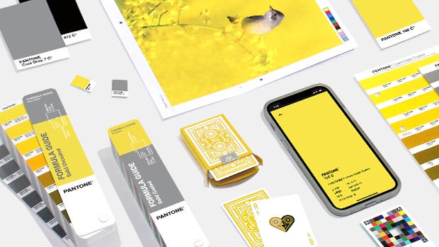
Tools For Designers
More than 10 million designers and producers around the world rely on Pantone products and services to help define, communicate and control color from inspiration to realization – leveraging advanced X-Rite technology to achieve color consistency across various materials and finishes for graphics, fashion and product design. Pantone Standards feature digital and physical color specification and workflow tools.
Read on to learn more about applying the Color of the Year 2020 across various industries, determine color values across our color systems, explore palettes and color harmonies and more.
USAGE
A marriage of strength and optimism, PANTONE 17-5104 Ultimate Gray + PANTONE 13-0647 Illuminating do not have to be used in equal proportions. Either color can take precedence, whether for apparel, beauty, home furnishings, product design, or packaging, or if you want more yellow than gray in your final product.
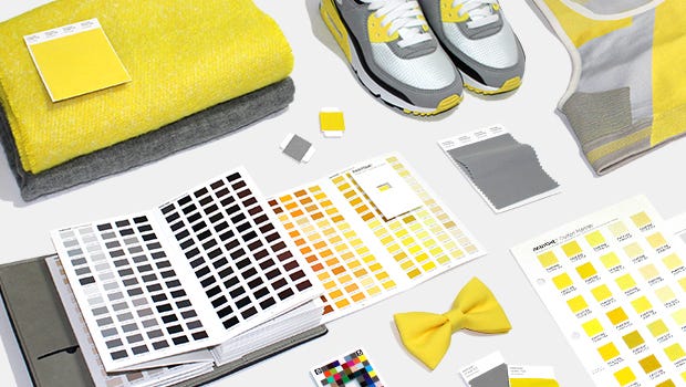
ULTIMATE GRAY + ILLUMINATING IN APPAREL AND FASHION ACCESSORIES
punctuated by a touch of PANTONE 17-5104 Ultimate Gray, conveys a message of sunshine (yellow) and strength. Enduring Ultimate Gray provides a great bouncing off point with Illuminating bringing in some brightness by way of a scarf, footwear, handbag, shawl, tops. With its energetic presence the marriage of Ultimate Gray and Illuminating are a great combination for activewear. The high visibility contrast of Illuminating and Ultimate Gray adds to its appeal for outerwear.
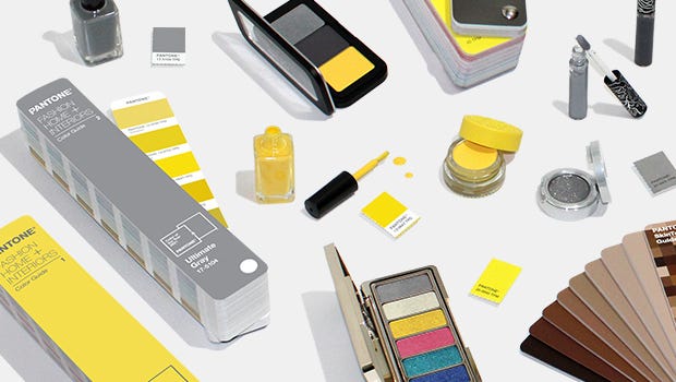
ULTIMATE GRAY + ILLUMINATING IN BEAUTY
A mix of warm and cool tones, combining PANTONE 17-5104 Ultimate Gray and PANTONE 13-0647 Illuminating in hair or nail makes a dramatic statement. Illuminating sparkles and shimmers when paired with Ultimate Gray in eye make-up.
ULTIMATE GRAY + ILLUMINATING IN HOME DÉCOR
PANTONE 17-5104 Ultimate Gray and PANTONE 13-0647 Illuminating are a great combination to set the mood in any room in the home, adding a dose of sunshine and positivity. Juxtaposing Illuminating with Ultimate Gray in table linens, sheeting, and home accessories including pillows and tabletop infuses vitality and liveliness. Painting a front door in bright yellow Illuminating conveys a warm and welcoming message when supported by solid and dependable Ultimate Gray in the exterior finishes. The ideal combination for any office, whether in the home or in a commercial space, with Ultimate Gray providing the firm foundation for Illuminating, a vibrant yellow that heightens awareness and enhances intuition, lighting the way to the intellectual curiosity, originality, and resourcefulness of an open mind.
ULTIMATE GRAY + ILLUMINATING IN PACKAGING AND MULTI-MEDIA DESIGN
Pairing PANTONE 13-0647 Illuminating, the color of highest visibility and reflectivity with resilient PANTONE 17-5104 Ultimate Gray produces a visually noticeable message no matter where it appears. The coupling of friendly Illuminating with quietly assuring Ultimate Gray infuses a message of vitality into a firm foundation of reliability, wisdom and experience for packaging and multi-media design.
Palette Exploration
HOW TO USE THE PANTONE COLOR OF THE YEAR 2021
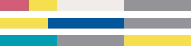
We have created five unique color palettes featuring PANTONE 17-5104 Ultimate Gray and PANTONE 13-0647 Illuminating to help you bring this year’s special shades into your designs. Each palette conveys a different mood, illustrating the versatility of Ultimate Gray + Illuminating, and is supported by three suggested color combinations.
GET THE ULTIMATE GRAY + ILLUMINATING PALETTES
Pantone Connect, a digital colour platform for designers available on web, via mobile apps, and as an extension for Adobe® Creative Cloud®, includes five different pre-loaded colour palettes featuring Ultimate Gray + Illuminating. These Color of the Year-themed palettes, along with every other Pantone Colour, are available to share, save and use in your design files within Adobe Photoshop®, Illustrator®, and InDesign®. With a free Pantone Connect account, designers can access many other time-saving features to find inspirational colours, save colour palettes, and design with achievable Pantone Colour.
DOWNLOAD FROM THE ADOBE EXCHANGE MARKETPLACE
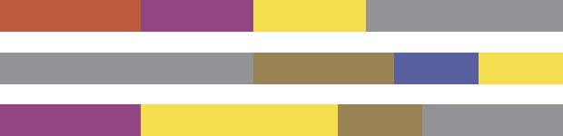
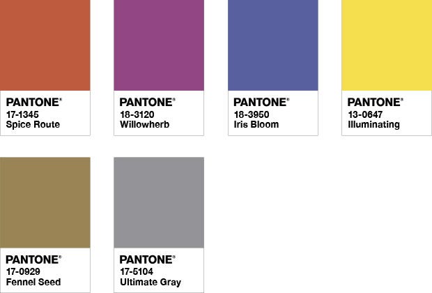
AVIARY
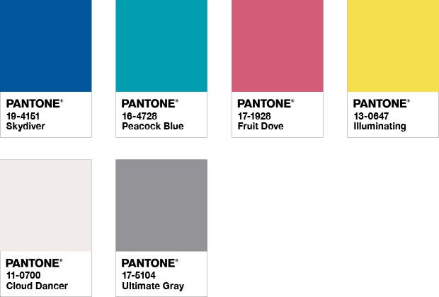
Aviary is a lively and joyful grouping of colour emblematic of vibrant and eye-catching rich bird plumage. PANTONE 17-5104 Ultimate Gray brings a natural element to this upbeat palette of cheery brights that includes PANTONE 13-0647 Illuminating, while the contrast of a lofty white PANTONE 11-4201 Cloud Dancer injects drama.
COLOR HARMONIES
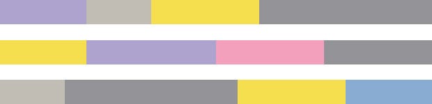
ENLIGHTENMENT
Evocative of a hypnotic space that expands our mind into another realm, the youthful and future facing colour story in Enlightenment stimulates our desire to reimagine. The pairing of PANTONE 17-5104 Ultimate Gray and PANTONE 13-0647 Illuminating blends wisdom and experience with our desire to press forward toward new ways of thinking and reveal new insights, while a silvery metallic PANTONE 20-0087 Lead Crystal adds a moonlight shimmer.
COLOR HARMONIES
INTRIGUE
Suggestive of the early evening sky, the boundless PANTONE Classic Blue 19-4052 creates an elegant backdrop for a glittery grouping of sophisticated shades painted across the sky, adding illuminating sparkle to a Desert Twilight.
COLOR HARMONIES
ORBITAL
An intriguing and adventurous potpourri of tastes and colors reflective of natural seasonings, condiments and blue foods. Foods in blue similar to PANTONE 19-4052 Classic Blue are rich in anthocyanins, and with their relationship to wellness and self-care, help to build a solid foundation, acting as a form of protection for good health.
COLOR HARMONIES
UNTRADITIONAL
Nothing says untraditional better than an unusual and unexpected palette of colors. Standing at the helm is PANTONE 19-4052 Classic Blue, a foundational shade that sets the stage for unique combinations and fun color mixes, as well as other outrageous and surprisingly shimmery fashion statements.
COLOR HARMONIES
DESIGN WITH TRENDING PALETTES BY CREATING A FREE PANTONE CONNECT ACCOUNT