Why Pantone?
Accurately tinted guides from Pantone are the building blocks of a legacy in the graphic colour industry. The PMS, although introduced in the 1960s, revolutionized how colour is communicated and produced on various media. It allows designers to specify exact colour and ensure it will look the same no matter where or how that colour is reproduced. In an industry where consistency is key, especially in branding and product design, with Pantone graphics, one is provided with the relevant tools to succeed.
The Role of Colour in Graphics
Colour is not strictly a visual but rather a medium of communication. In graphic design, appropriate selection of colours can stir emotions, lead to the imparting of information, and may even spur one towards certain actions. Think of some recognizable brand logos: Coca-Cola, Facebook, or McDonald's. The colour their brands bear is not coincidental. They are deliberately selected, consistent, and easily identifiable. It's the critical job of Pantone to make sure that these colours appear identical on screen, in print, or on a billboard, irrespective of the medium and location.
In today's highly visually oriented world, graphic colour consistency is more important than ever. People expect a brand to implement the same aesthetic on its packaging, digital content, and so on. Pantone's graphic colour solutions allow businesses and creatives to maintain that level of consistency so the colours they choose will look exactly as they should.
Pantone Products for the Graphic Industry
Pantone provides a suite of products that can help service the needs of the graphic design and print industries. These range from Pantone guides and swatches to various digital tools, all of which serve to help designers achieve perfect colour harmony.
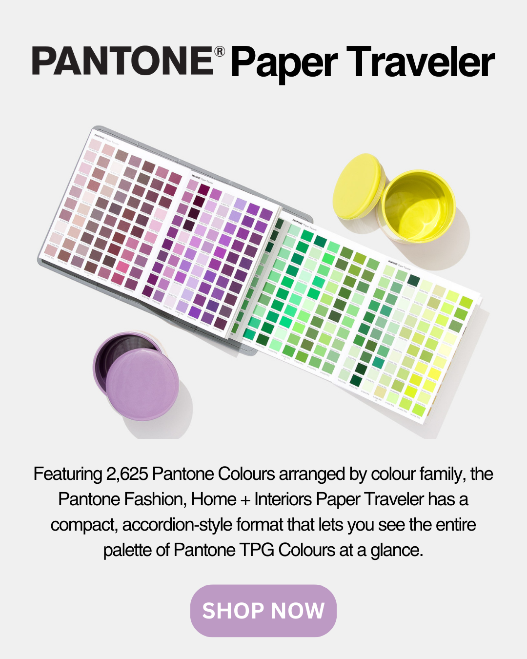
Colour guides: Perhaps one of the most renowned products of Pantone is what is called a Pantone Colour Guide - a portable reference displaying thousands of Pantone colours. This guide becomes a pre-requisite for any designer on print media, as this would ensure that the colours he chooses would be perfectly reproduced by printers.
Pantone Colour Bridge: A good guide, the Pantone Colour Bridge has the Pantone spot colours alongside their closest CMYK equivalents. This can be quite helpful for designers who work in both print and digital format, as it helps them choose colours that will appear consistently across both mediums.
PANTONE Swatches: These are physical colour chips that give you a tangible reference for the colours you're working with. They're ideal for anyone working in print design, product packaging, or any medium where exact colour matching is crucial.
Pantone Digital Tools: Besides that, for people working in the digital arena, Pantone has a set of software tools that will enable the seamless integration of Pantone colours into your design software. These digital tools create a reproducing colour on your screen that matches what you will see in print and give you a comfortable feeling in your workflow from digital to physical media.
The Benefits of Using Pantone Graphics in Australia
It enables Australian designers and businesses to meet the ever-increasing demand for colour consistency. In the competitive market, when brands struggle to rise above, having reliable colour standards may be that difference that makes them stand out or go unnoticed.
Pantone also helps to cut on the guesswork involved in colour selection. With the graphic colour products from Pantone, you know what you will get, and revisions due to colour will be reduced, hence your final product will be what you had in mind. Whether it's for a local campaign or a global brand, the standards for Pantone colour make sure your graphics will appear precisely the same, no matter where they show up.
Another plus of this for Australian professionals is that products by Pantone are widely available through local distributors like Pantone Australia. This means you will get easy access to whatever tools or products you might need in this regard without having to wait too much for shipping times or dealing with international suppliers. Let this convenience enable you to stay on top of your projects, ensuring timely delivery and consistent quality.
Conclusion: Trust Pantone to take care of your graphic colour requirements.
It's not just a system for matching colours but a trusted partner for creative professionals around the world. From guides and swatches to digital design tools, Pantone's suite of graphic colour products can help you be confident in exactly how your designs will look. Whether you are a designer into print, a brand manager that oversees product packaging, or an artist of digital media, with Pantone, your assurance is that colours will remain consistent, bright, and as true as possible to your vision.
Right here in Australia, the products of Pantone are accessible, affording you the use of professional tools being utilized by leading designers and brands in every single part of the world. Whether you belong to the graphic design or print industry, when it comes to delivering quality work in a really crowded marketplace, Pantone's colour standards are non-negotiable. With Pantone, rest assured that your creative ideas will be brought alive with just the perfect colour, right each and every time.