PANTONE COLOR OF THE YEAR 2018

PANTONE COLOR OF THE YEAR 2018
PANTONE 18-3838 ULTRA VIOLET
INVENTIVE AND IMAGINATIVE, ULTRA VIOLET LIGHTS THE WAY TO WHAT IS YET TO COME.
A dramatically provocative and thoughtful purple shade, PANTONE 18-3838 Ultra Violet communicates originality, ingenuity, and visionary thinking that points us toward the future.
Complex and contemplative, Ultra Violet suggests the mysteries of the cosmos, the intrigue of what lies ahead, and the discoveries beyond where we are now. The vast and limitless night sky is symbolic of what is possible and continues to inspire the desire to pursue a world beyond our own.
Enigmatic purples have also long been symbolic of counterculture, unconventionality, and artistic brilliance. Musical icons Prince, David Bowie, and Jimi Hendrix brought shades of Ultra Violet to the forefront of western pop culture as personal expressions of individuality. Nuanced and full of emotion, the depth of PANTONE 18-3838 Ultra Violet symbolizes experimentation and non-conformity, spurring individuals to imagine their unique mark on the world, and push boundaries through creative outlets.
Historically, there has been a mystical or spiritual quality attached to Ultra Violet. This purple colour is often associated with mindfulness practices, which offer a higher ground to those seeking refuge from today’s over-stimulated world. The use of purple-toned lighting in meditation spaces and other gathering places energizes the communities that gather there and inspire connection.
Tools For Designers
Each day, over 10 million designers and manufacturers work with Pantone to select, communicate, and approve colour in design. We organize nearly 5,000 Pantone Colors into two Systems, one for print and packaging and the other for fashion and product design. Want to learn which Pantone products are right for your next project?
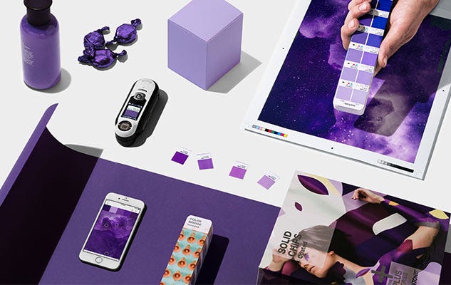
ULTRA VIOLET IN GRAPHICS DESIGN AND PACKAGING
As packaging design becomes more sophisticated, Ultra Violet offers complexity and nuance that appeals to our desire for originality in all that we touch. Similarly, in graphic design, Ultra Violet resonates with this dynamic medium through its multi-dimensional feeling. Shades of Ultra Violet are increasingly used in packaging and graphic design by forward-looking brands in the CPG, luxury, and beauty worlds as well as by personalities and artists seeking to stand out.
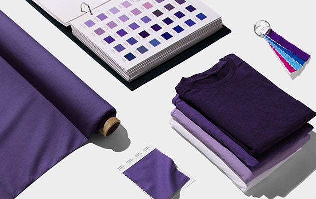
ULTRA VIOLET IN FASHION
On the runway or the streets, Ultra Violet is an enchanting purple that provides a theatrical linkage for both men’s and women’s styles. True to the coupled nature of Ultra Violet, created by combining red and blue, Ultra Violet lends itself to unique colour combinations in fashion and is easier to pair with all colours on the spectrum than one might think. With golds or other metallics, Ultra Violet becomes luxurious and dazzling; with greens or greys it evokes natural elegance. Similarly, Ultra Violet takes on distinct appearances with different materials. Lush velvets in the colour suggest intrigue for evening, but are also unexpectedly modern in athleisure or sneakers. In accessories, jewellery, and eyewear, Ultra Violet suggests the complexities of natural gems, textures, and florals.
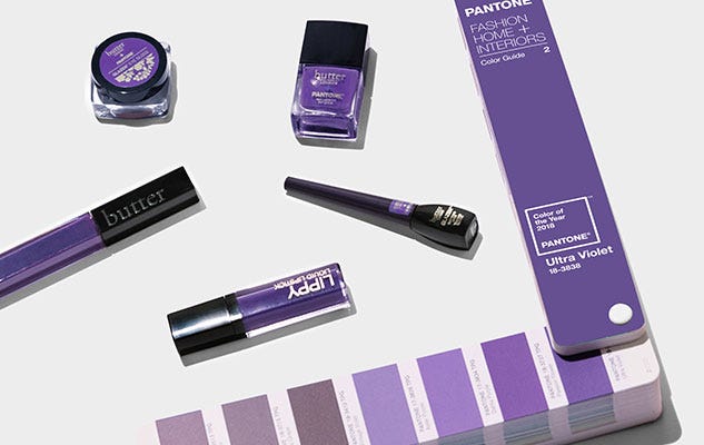
ULTRA VIOLET IN BEAUTY
Ultra Violet becomes spell-binding and steeped in spirituality in beauty to create expressive looks for all. The complex and deep nature of the colour is well-suited for beauty looks created by combinations, blends, and ombres. A singular matte purple on the lips or nails makes a bold statement of non-conformity, while softly blended metallics and shimmers in Ultra Violet transform the eyes into windows to the cosmos. Pantone Purple shades in hair continue to elevate street styles as a symbol of creative expression. On the palette for every beauty medium, Ultra Violet complements and emboldens every other colour, adding complexity and mystery.
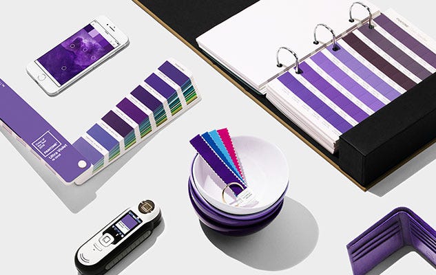
ULTRA VIOLET IN HOME DÉCOR
In interiors, Ultra Violet can transform a room into one of extraordinary self-expression, or conversely its polish can tone down a room with subdued, modern pairings. Adding spice and brightness, Ultra Violet calls attention to a tufted couch, piece of art, or accent wall. As a color that can take you in so many directions, Ultra Violet makes a statement in any space, whether it’s one of tradition and elegance or unexpected boldness. In hospitality, we are seeing purples like Ultra Violet take center stage in interior spaces as large and small hotels harness color and design to entice travelers and stay relevant.
How To Use The Pantone Color Of The Year 2018
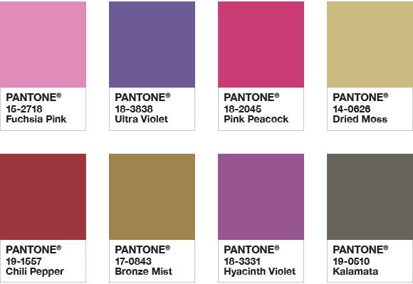
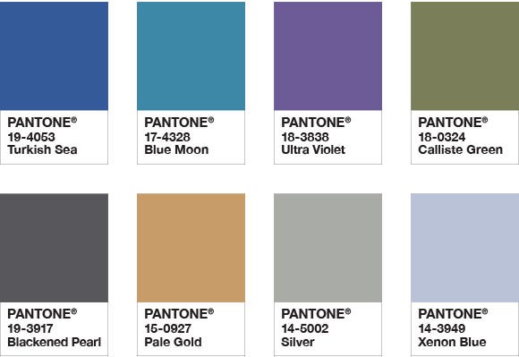
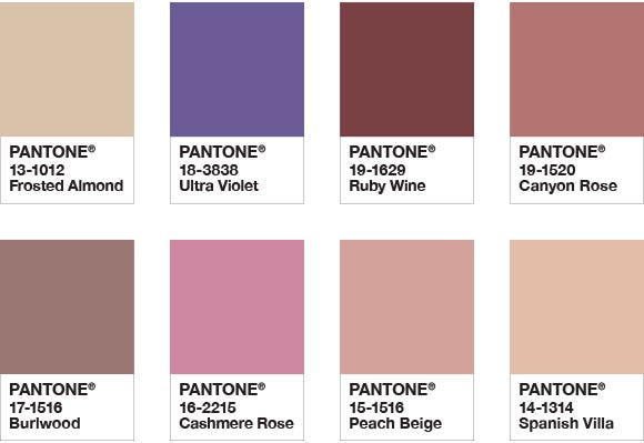
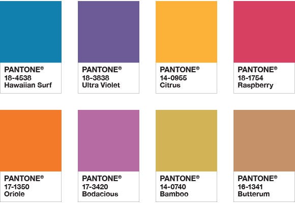
We have created eight different color palettes that feature PANTONE 18-3838 Ultra Violet to help you bring this year's special shade into your designs. All color bases are covered; brights, deeper hues, pastels, mid-tones, and metallics. With Ultra Violet as a versatile trans-seasonal and gender-neutral anchor in every palette, each of the eight palettes conveys its own distinctive feeling and mood and can easily cross-over fashion and accessories, beauty, home interiors, and graphic design applications.
To further inspire your creative juices, within each of these eight color stories we have also included three suggested color harmonies. The color harmonies provide you with examples of how individual colors in the palette can be mixed together and in what proportion or measure. The uniquely developed color bars which make up the color harmony accompany each highlighted color story.
We also strongly encourage you to explore each of these eight palettes on your own. Create your own combinations. Develop your own individualized color mixes. Imagine and invent. Experiment and express. And most importantly, have fun. There has never been a better time to be original and leave your very own colorful mark on the world.
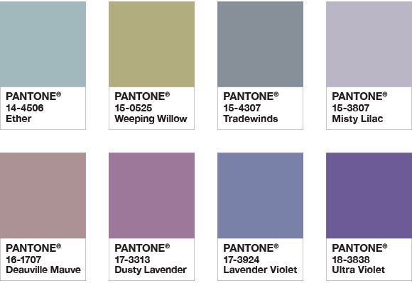
PURPLE HAZE
Embodying calmness, a palette of hazy and smoky hues effortlessly commingle to create subtle blends and harmonies that are both timeless and time-honored.
COLOR HARMONIES

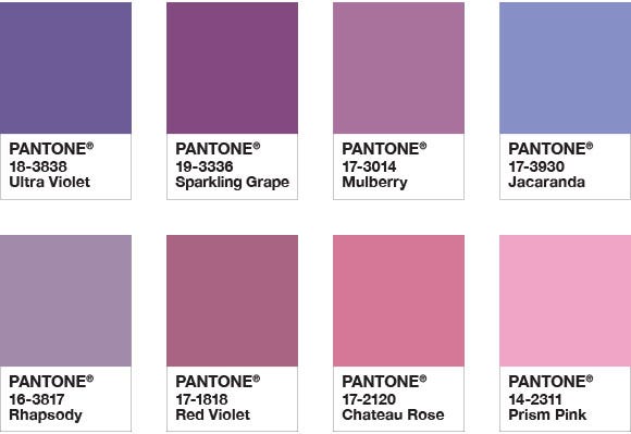
KINDRED SPIRITS
Sitting side by side on the color wheel, this palette of like-minded hues with their spirited good humor and playful exuberance makes for easy and engaging color mixes.
COLOR HARMONIES

DRAMA QUEEN
An unusual combination of show-stopping saturated color with rich and elegant earth tones creates an adventurous mood full of excitement and drama.
COLOR HARMONIES

INTRIGUE
Invoking a sense of mystery, a palette of nature's blues and greens, combined with the unconventional Ultra Violet and a Silver and Pale Gold metallic, exudes a quiet strength.
COLOR HARMONIES

QUIETUDE
Soft and warm, a subtle palette of natural and organic shades accented by a Frosted Almond metallic evokes reassurance and conveys a sense of calm and quiet.
COLOR HARMONIES

ATTITUDE
Exploding with zest and energy, this palette of pure, unadulterated color which screams “look at me” comes together to create a bold statement with feelings of excitement and high voltage effects.
COLOR HARMONIES

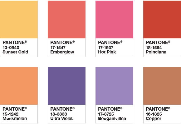
DESERT SUNSET
Emulating a desert sunset, this is a dramatic palette of brilliantly heightened warm shades that radiate resplendently across the early evening sky.
COLOR HARMONIES

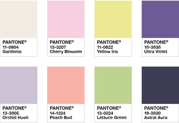
FLORAL FANTASIES
Inspired by the colors we see in our surroundings, a combination of soft and sweet pastels with an enchanting Ultra Violet and a deep, dark navy Astral Aura conjures up a summer garden in full bloom.
COLOR HARMONIES

