SKU: VH2023
$852.00
Excl. GST
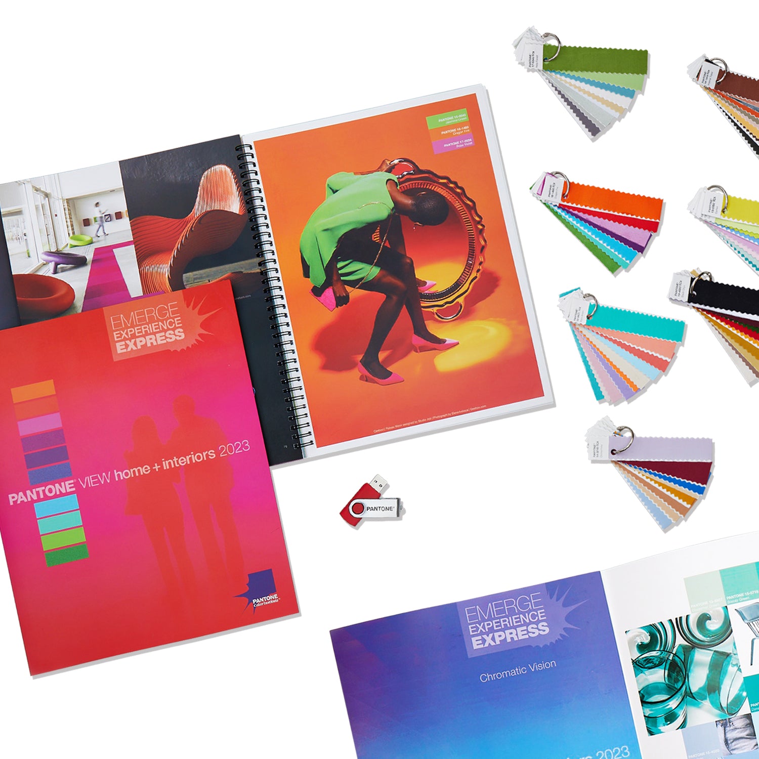

PANTONEVIEW Home + Interiors 2023 with Cotton Swatch Standards
Emerge, Experience, Express
A new color vibration reflects a life affirming outlook with new creative realities.
Colors for home furnishings in 2023 entice us to engage with what we believe, what we love and what we want. Youthful, tech-inflected pastels and vivid brights radiating positivity encourage us to dive into life while warm neutrals and upbeat midtones further communicate their optimistic message in their quieter but nonetheless positive manner. Cool neutrals take on a celebratory aspect as shimmering metallics displaying undeniable notes of glamour and style. We are ready for good times and great feelings, and the colors we hunger for capture this wave of delight.
Format
Color
Application